


By Daniel Ritz
It shouldn’t have been a surprise when Frankie Michinock, 23, of Laguna Niguel, admitted that she didn’t have a printed copy of her award-winning 2018 Festival of Whales graphic.
After being identified as one of the top five logos by the Festival of Whales Board of Directors from over 70 entries, Michinock—who is rather humble—was blown away after being named a finalist, and later received just under one thousand votes in the public voting section hosted on social media. Not long after the polls closed on social media she was crowned, leaving little time to absorb the news in full.
“I still can’t believe this. I’m in shock,” Michinock exclaimed while looking overwhelmed with the attention. “It’s unbelievable. I can’t thank my friends, family and everyone who voted enough.”
This was Michinock’s third time entering the Festival of Whales logo design contest. The Laguna Niguel resident and Dana Hills High School graduate placed fourth her sophomore year of high school in 2010 and second in 2012, but said she has always identified with Dana Point as home and definitely felt motivated—and a bit of pressure—from her hometown pride while designing this year’s award-winning graphic.
Michinock said that it was during her time at Dana Hills, under the motivational tutelage of Visual and Performing Arts Department Chair Natalie Hribar-Kelly, that she began to believe in her skills in the arts.
For her latest entry, Michinock said that she was inspired by the graphics on the trolleys that circulated Dana Point over the summer.
“I wanted to give my design a timeless feel,” Michinock said. “All of the designs (in the past) were incredible, but I thought it was important to create a graphic that appealed to a wide variety of people. I wanted it to resonate with everyone who calls this town home.”
When speaking about the technicalities behind her design, Michinock spoke confidently.
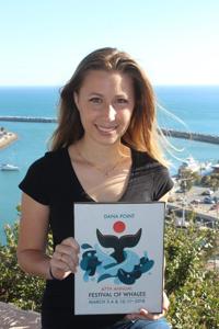
“Obviously, I wanted the whale to be the main focus, held by the waves and supported by Dana Point,” Michinock explained. “I have always loved Disney and have been inspired by their three-tier visuals too.”
She said the whale tail is meant to be “held” by the waves in the sea and its central position is symbolic to the mammal’s cultural and historical relevance in Dana Point. The orange dot in the background represents both the sun and the “point” in Dana Point, a key geographical location in Orange County.
Color choice was also a large focus for Michinock in her winning design.
“I usually don’t focus too much on colors,” she admitted. “I prefer to work in gray-scale. However, in this design, I relied heavily on my understanding of the pantone scale that I recently studied in college.”
After graduating from California State University-Fullerton in spring 2017 with a double major in illustration and graphic design, Michinock is actively pursuing her passions in Orange County. These days, she said she is excited by innovative and creative package design, the intersection of beauty and tangibility.
“I’ve always been focused on function-first art. If it isn’t useful, I’m not interested,” Michinock said.
This functionality-first mentality assisted her process, as her logo will be placed on thousands of pieces of festival merchandise for the 2018 Festival of Whales.
“Not only did we end up with dozens of beautiful entries to choose from, but the variety of design styles was really great,” said Festival of Whales Foundation Co-Chair Donna Kalez. “We are very happy with the final product.”
The Dana Point Festival of Whales will be held on March 3-4, and March 10-11, 2018. For more details, visit www.festivalofwhales.com/